
Five Cover Trends I Love:
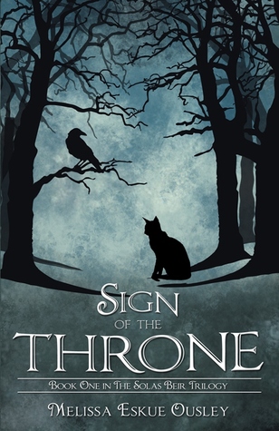
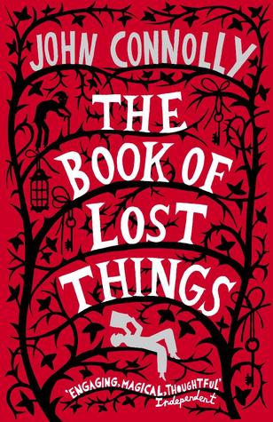
1) Silhouettes. I have always loved covers that are made up of, or do something interesting with silhouettes. I just think they're gorgeous! They can be basic or they can be elaborate, I just think they look magical. It's probably my favourite book trend that I like so of course it had to go on the list!
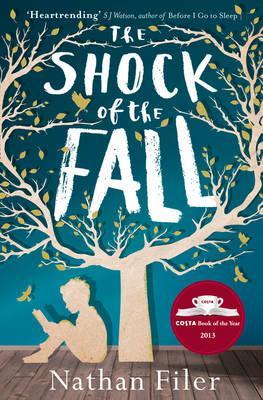


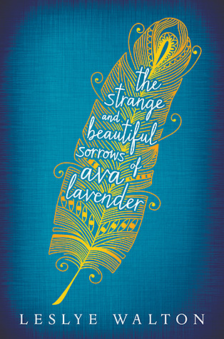
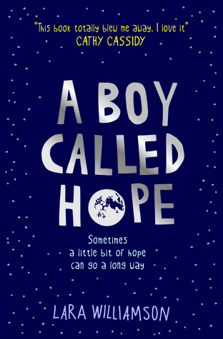
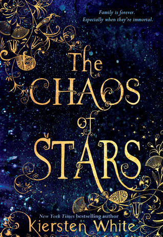
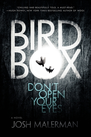
2) Simple/Text-Based. Sometimes covers don't need a huge picture to make them appealing. There are some gorgeous fonts out there that stand out just as well, and I think simplicity in a cover is sometimes key to making a good one. I feel like these covers are often really unique as well, where as picture covers can get a little samey.


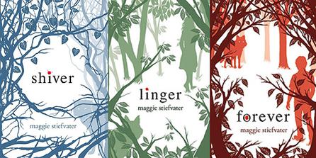
3) Matching Series Covers. I have a bit of an obsession with books in a series, or even books by the same author, having similar or matching covers. It makes me feel so happy when I find a series where the cover art runs along a similar theme, and I always strive to collect those matching covers!


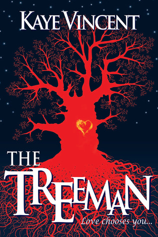
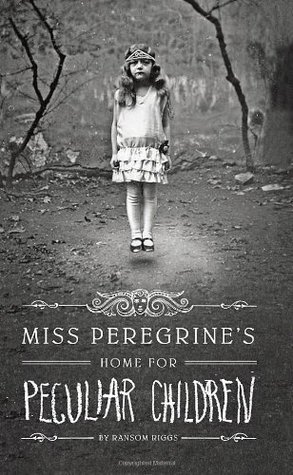
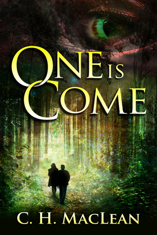
4) Dark/Creepy/Gothic Covers. I have always been, and always will be, a sucker for a creepy-looking book cover. I have no idea why, I'm just one of the weird people who likes a dash of the macabre, and so my attention is always attracted by these kinds of covers. Often they're pretty dark and/or styled like old photographs. I just really like them!


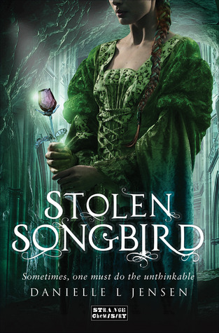
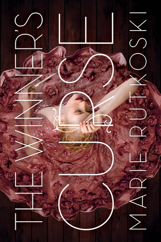
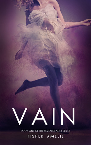
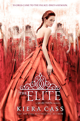
5) Girls In Dresses. Okay so I know this is going to be a controversial one this week. This is a very popular cover art style used probably far too much. And there are a lot of instances where I think it is done appallingly. However, when it is done right, I think these covers can be so beautiful! The dresses look like something out of a fairy-tale and they just make me smile.


Five Cover Trends I Do Not Like:
1) Bad Designs. You know those covers you see that look like someone has tried to put something together in Photoshop fifteen minutes before it's due? Yeah those. They just make me cringe! I know them as soon as I see them, I just get that overwhelming feeling that someone has not worked hard on it at all. That's a real shame too because the story inside might be fantastic!


2) Shirtless Men. There is just something about seeing nothing on the cover but a shirtless man that makes me roll my eyes. It's a trend I've seen about a lot, on a whole host of books (though mostly the more adult ones) and it probably has a lot to do with the fact that I never find those men sexy in any way, shape or form, as well as my lack of enjoyment for those kind of novels. A lot of them suffer from a pretty bad photo-shop job too which is just even worse.


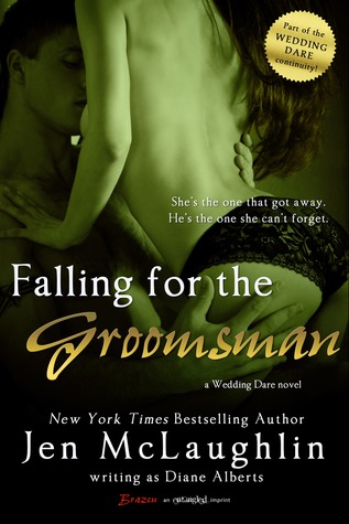
3) Couples. Okay, so can you tell that I'm not overly interested in Romance fiction yet? I like finding romance story-lines within other genres, but I just can't seem to stomach it when the book is just a dragged out love story. There's a reason I haven't read and never will read 'Fifty Shades Of Grey'. Couples on the front of covers makes me cringe a lot of the time. I don't mind the sweet ones holding hands or gazing adoringly at each other quite so much, but like shirtless men, I don't like smutty covers.


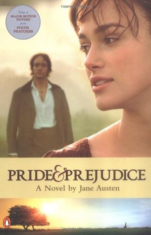
4) Movie/TV Tie-Ins. This is quite a big pet hate of mine. When a movie gets released that is based on a book, nine times out of ten that book is released with a new cover which is normally a still from the movie. I find these covers lazy (they're normally the DVD cover too) and plain annoying! Especially when I'm walking into a bookstore after a cover that matches a set and they only sell the movie themed version!


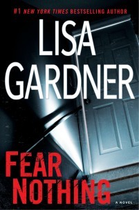
5) Thriller/Suspense/Crime Covers. We have all seen these books. They are normally in the Crime/Suspense/Thriller section, and to me, they all look the same! Some sort of meaningless, gloomy-looking scenery shot in the background with huge great letters (normally looking a bit scratched out for 'added effect') in front. I just get so bored of seeing them everywhere and none of them ever stand out to me.


This week's topic was so much fun. I can't wait to see what everyone else has come up with!
No comments:
Post a Comment